
Here's how to make your Figma prototype responsive in 6 simple steps
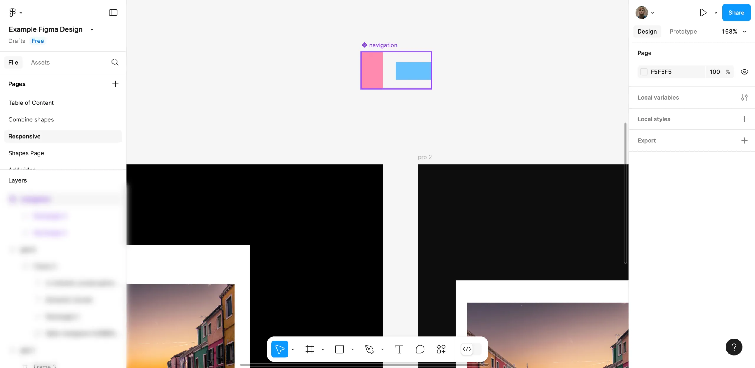
1.Always use frames instead of groups as this allows you to manage layouts on different devices.
2.Give Elements Boundaries Put boundaries such as left, right, top or scale, on the elements to keep them fixed when you resize.
3.Allow Auto Layout With Auto Layout turned on, your components will adjust their spacing and size automatically whenever the content or screen changes.
4.Breakpoints are a great way to prepare your prototype for different screen sizes.
5.Test Using the Presentation Mode: Presentation mode in Figma helps you identify any layout issues or responses to resizing.
6.Make necessary changes to padding, margins and spacing of each element on every device breakpoint to achieve a neat and well-organized result.
FAQ'S
How to Make the Figma Prototype Responsive
We make websites that bring joy and meet your goals.
We create digital experiences that not only capture the users but also empower businesses in a highly competitive world. We are dedicated towards developing creative solutions that will easily fuse creativity with functionality, with long-lasting effects.

