Best Marketing Websites To Inspire Your Next Project In 2025


When it comes to building a standout brand online, your website plays a huge role—and you know it’s got to make a great first impression. The best marketing websites in 2025 aren’t just about flashy visuals. They connect with your audience, guide them through your message, and inspire them to take action. Whether you’re a business owner, marketer, or designer, exploring top examples can give you fresh ideas for your own site. From creative layouts to engaging copy and bold branding, these websites show how to truly grab attention. Think of this as your go-to list for design and strategy inspiration. You’ll see what’s working right now—and how you can use similar techniques to elevate your marketing game and impress your visitors.
Here Are 4 Key Aspects Of The Best Marketing Websites In 2025
1. Clear and Compelling Messaging
You only have a moment to impress visitors with your site. That’s why top marketing websites begin by sending simple but direct messages targeted at your audience. It should give your site visitors the straight answer to a basic question. “What’s in it for me?” Whether your ad is for a product or service, your headline and supporting statements should be brief, clear, and emphasize what your customers gain. Engage your users in a conversation that avoids industry buzzwords. Emphasize what you do that solves problems and makes life simpler for your customers. Great messaging builds trust fast. And remember: When your users quickly grasp your website’s purpose, they are more likely to check out your offers and eventually participate online.
2. User-Friendly Design and Navigation
A site that looks great but doesn’t show the answers users are seeking will not convert well. As a result, leading marketing sites make sure their navigation is simple for everyone to use. Visitors to your site should flow through the homepage, to your services, and then to the about page or contact form easily.Each interaction should be quick, smooth, and stress-free. If the website is well organized and has bold headings and clear buttons, your users will stay focused. More than appearances, good design should help your audience use and enjoy your content easily. In addition, websites must be designed for different types of devices. Your website should look great and work flawlessly on all devices your visitors are using. When people feel familiar with your website, they’re more likely to trust you and take action.
3. Strong Visual Branding
The look and feel your visitors take away from your site is not limited to a logo; it’s your visual identity. To be noticed and remembered, companies are adopting bold and distinctive visual branding on their marketing websites in 2025. Remember to set the colors, typefaces, pictures, icons, and animation for your website. Every part of your brand needs to represent you and connect with your intended customers. A distinctive way of displaying things on your site helps your brand be remembered well after people visit. Flashy design isn’t necessary. Instead, make your visuals clean and make sure they help convey your message for a professional look. If your branding is great,It shows that you care about the details and creates credibility with visitors.
4. Effective Calls to Action (CTAs)
A web page in marketing that doesn’t encourage users to take action is pointless to sales. You’ve walked your visitors through, proven the value, now let them know what their next step is. Good CTAs are easy to identify and clearly guide users toward the intended action. PixelPlex expects your call to action to translate as easy and useful, no matter if users sign up for anything, ask the business for a quote, or test new products with a demo. A good example is telling users to “Get started,” “Download now,” or “Schedule your free consultation.” Do not use “Click here” for your link text. Keep the main CTA on each page so users will have just one important action to take. Consider laying out your CTA several times throughout the page so that visitors can find it when they’re ready. Making your users’ decisions clear and uncomplicated is important.
Here Are 12 Great Examples Of The Best Marketing Agency Websites In 2025
1. Red Antler
The website well illustrates Red Antler’s goal to help create exciting brands from day one. Bold words, artwork, and a few colors are used on the homepage to make the site easy to trust. What’s great is that the UX is easy to understand, and nothing is confusing or takes too much time to read. Real examples are at the heart of the website, presented in a clear format that works on mobile. This site is different because it’s straightforward without any unnecessary frills. Since brands use storytelling, their personalities stand out. If you are an entrepreneur or marketer, Red Antler’s website will show you how to create something that feels original. Because you’re guided rather than sold, they represent their founder-first viewpoint. It puts as much effort into looking pretty as it does in making a clear offer to visitors.
2. SmartSites
The SmartSites site is built to help users convert. The site is designed mainly for businesses, with services, feedback, and examples front and accessible. Every section will show you CTAs that are always the same and uncomplicated. One thing I’ve noticed is how they use statistics and recognition from clients to show they are trustworthy. You can see phrases like “top-rated agency” mentioned early, letting you feel secure about their reputation. You can easily move through the site on a mobile device, helping you understand all the different SEO and PPC services offered. Real performance metrics and graphics are used in case studies to demonstrate success. It’s obvious to you that data, performance, and users are very important to them. This tool is useful if you need results you can measure as a marketer or small business owner.
3. Ueno
Ueno’s former website is still an excellent example of good creative agency design. Its approach was to combine interesting language with standout visuals to present work and the person behind the work. Some sections simply jumped, introduced surprising animations, or featured text with a sense of humor.The site felt like a journey—not just a scroll with your thumb. They recognized the value of letting the team share who they are and what they do—something few agencies bother with. The case studies really involved readers, reaching the right balance between narrative and visuals. Even though Ueno combined with Twitter/X, many designers and agencies admire the UX and simplicity of their past website. If you find personality in branding important and want your website to be amusing yet highly functional, Ueno’s site is a wonderful example.
4. Clay
Clay’s website shows what top digital design looks like. As soon as you reach their website homepage, you can see they spent a lot of time arranging everything. You see beautiful animation and clean designs that highlight how much they value good UX/UI. Even with a simple layout, what CiSD shares is full of details—images and short descriptions highlight the different projects. A subtle and fashionable color scheme on the website adds a professional look. Once you click on the site, it’s easy to tell that this is a major agency. It’s particularly helpful for businesses that want attention to detail, strong performance, and a nice user interface. If you want to start off with a great website online, Jason’s site shows the way to use technology in a stylish manner.
5. Beyond
Website content at Beyond is driven by its strategic storytelling approach. The website starts with a message about what they do, then leads you into fun and useful interactive features. Each part of their site helps you learn about their process. Rather than only describing their actions, they act out their values. Page scrolls smoothly, and the content modules are interactive, so users can discover more. The visuals aren’t just decoration; they explain why Beyond helps companies deal with practical challenges. If you care about content and its presentation, you can see from Beyond’s website how you can present information clearly but with visual appeal.
6. Wpromote

At the first glance, the agency appears to be dedicated to achieving results with data. Using bold phrases, clear calls to action, and customer reviews encourages people to purchase. They write to you as if you are personally dealing with the pressures of enlarging your audience, speeding up conversions, or getting involved in fresh markets. Every section includes proof points: I provide client logos, figures on their progress, and charts of their work. It’s broken down clearly and aims to help anyone convert. The interface is lively, yet not disorganized, which proves they get both corporate requirements and digital planning. As a business owner or marketing executive, the language you’ll find on Wpromote’s website is easy to understand and seems to reflect your needs.
7. RNO1
RNO1’s website demonstrates its background in west-coast digital experience, showcasing bold design that’s very engaging. As soon as you access the site, you’ll notice the app has smooth transitions and striking visuals that highlight brands that are free to change with the times. A different approach is taken, as companies hope you’ll make your personal vision match theirs. You should try it if you’re in the startup sphere, hoping to disrupt the usual ways of doing things. You’ll find that each case study is designed to be hands-on and gives you a sense of what the designers experienced. They express their services in a way that stirs inspiring emotions while delivering results. RNO1 isn’t just selling digital transformation; they want you to use your branding to take bold steps. If pushing boundaries and having a unique design is important to you, this website provides tools to help with user experience.
8. KOTA
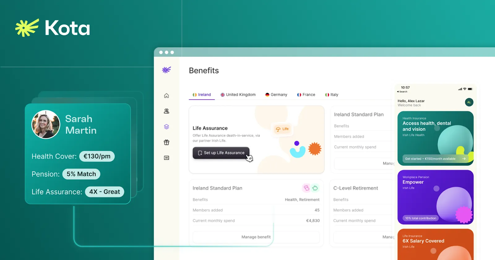
Design elegance and strategic focus work together on KOTA’s website. It uses stylish, eye-catching images and strong typography to make a lasting impression for users. You’re not only scrolling—you are also part of a carefully designed digital experience. The case studies feature captivating designs, detailed examples, real research, and a bit of character. Although the animations are just a hint, they still manage to lead your attention to important points. You are treated as a part of a group that genuinely loves using design. It’s simple to find what you need, and you’re assured of their process thanks to the information on each service page. If you’re in creative marketing or business, KOTA’ website demonstrates how you can enjoy beautiful and useful design at the same time. It’s a clever, neatly produced, and highly convincing form.
9. Beyond Agency
The site itself, made with the user in mind, shows how Beyond Agency places great importance on innovation. The space is clean upon entrance and arrays are well placed. Every section provides you with useful tips and information specific to your business. They break down complicated subjects in a way that demonstrates how using their services makes your business grow. What’s impressive is that their project breakdowns name true difficulties and offer options, making their process easier to grasp. Product owners or digital strategy experts will appreciate how this site puts clarity and outcomes over everything else. Rather than focusing on big branding, agency work tends to create designs that have real impact, which you see in their choices. Support and clear information are what you get, you do not feel the spin aimed at selling.
10. Hello Monday
Once you’re on their site, it feels like you’re helping a digital toy take shape, as all the interactions are fun and welcome changes. The homepage is exciting, bright, and knows how to guide users through appealing and unusual interactions. You, the user, are led into each new project by following a storyline. They help you understand the purpose behind every campaign by evoking emotion. It suits both creators, companies, and agencies hoping to be different and reach their audience effectively. Even the way they describe the team on their “About” page is both fun and informative. Seeing this site, it’s evident that beautiful design plus good stories bring out the best in digital environments. If you’re a person who sees branding as a main link to clients, the style of Hello Monday will appeal to your creative side.
11. B-Reel
The design of B-Reel’s site makes agency websites appear cinematic. Because of its dark backdrop and simple design, the site appears luxurious from the start. Each project moves you forward in much the same way a narrative would. Important brands make up their client base, and their studies demonstrate how they create impressive and sophisticated experiences. Both the messaging and the layout are simple and feel premium for anyone focused on having a professional chat experience. Designers who favor high-end looks will find this website to be very useful. It’s simple to see how each part of Pachinko feels focused on just you. The message is short but straight to the point; all words are chosen carefully. B-Reel’s website isn’t flashy; it’s been enhanced, is engaging, and created for users who appreciate well-told stories.
12. Locomotive
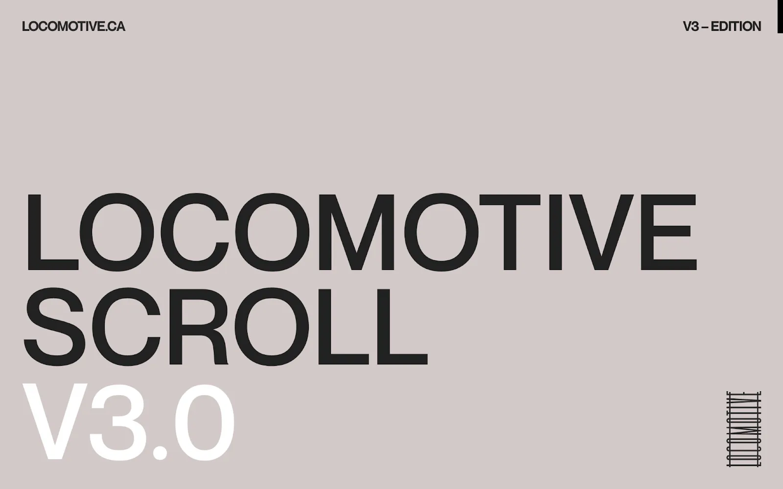
Locomotive’s website uses the latest design techniques. This is done by mixing strong fonts, large background pictures, and movements that appear as you scroll through the page. Every time you click on a post, you understand why this app is called Momentum. Everything in the layout is separate, clean, and highly responsive. Every project page shows how they solved the problem, in addition to what they built. They use creativity along with results-focused messaging to target people just like you, expecting striking creativity along with stable showings. This site is designed for startups and brands that want to stay ahead of the curve. Because the navigation is designed smoothly and for small screens, users have a great experience from any device. On their site, Locomotive demonstrates that they are just as enthusiastic about the process as the result—from beginning to end.
Conclusion
The best marketing agency sites use creativity, strategies, and the right user experience to make you and others remember their site. They prove that strong design and good functionality are needed to express the main values of a company clearly. By using bold images, simple navigation, and inspiring copy, websites allow you to reach your target audience while showing your true character. The guidance from each agency suits your situation, places importance on innovation, and is result-oriented. You’ll notice when visiting these top websites that good design can improve how credible and engaging a site is. Whenever you come across excellent marketing agency websites, they inspire you to lift your brand’s presence online through clarity, creativity, and connection. They demonstrate that you can use the lessons from digitalization to make your web presence both captivating and effective for your business.
FAQs
1.Why is having a great marketing agency website important for you?
2.How can your marketing agency website improve client engagement?
3.What should you include on your marketing agency website?
4.How do you make your marketing agency website mobile-friendly?
5.Can you update your marketing agency website easily?
We make websites that bring joy and meet your goals.
We create digital experiences that not only capture the users but also empower businesses in a highly competitive world. We are dedicated towards developing creative solutions that will easily fuse creativity with functionality, with long-lasting effects.

